Tuesday 21 April 2015

Monday 22 July 2013

Cambridge Town Bumps 2013

This time last year I rowed in the town bumps for the first time with Xpress Boat Club as a novice 'oarsman'.  It was exciting and nerve-racking in equal measure, generally exhausting, but above all a lot of fun.  I also created my own interactive version of the bumps charts using Tableau, which you can read all about here.

This years bumps has now finished and so it's time to publish this years chart. Not many changes from last year's attempt, but I have added a Summary sheet to record blades, spoons, headships etc.  I'll also try and get the bump location info from the main CRA bumps website.  In the meantime, here it is:


If you see any errors please let me know.

I'm also thinking about building an historical bumps interactive tracking the rise and fall of crews and clubs over the years.  Unfortunately most of the historical bumps charts on the CRA site are static images and manually coping in years of results would drive me bonkers, so if anyone knows where I might be able to find or get access to the data in a machine readable format (csv, json, html, xml, etc etc...) then let me know.

Thursday 11 July 2013

ATP Tour

Wimbledon has just finished and the latest ATP rankings were released on Monday. I'm a big fan of interactive bumps charts and so thought I'd take a look at how the ATP Tour top 100 ranks and points have changed over the years.  Here's a snapshot of the final result (still not convinced by the colours) and clicking on it will take you to the full interactive:


I scraped the data from the ATP Tour website with a python script and created an excel sheet formatted like this:


I didn't use the 'Week Change' or 'Tourn Played' columns in the end, but I did use the player names on their own to create bespoke filters for the chart.  Clicking on a player in either of the names lists will highlight their history in the rank and points charts.  Here's Andy Murray's rise to the top:


Clicking on a line in either of the charts will also highlight the selected player.

Go and explore.  :o)

Tuesday 14 May 2013

Weather charts

I was flicking through Edward Tufte's The Visual Display of Quantitative Information for the umpteenth time recently and came across a chart taken from the New York Times (chapter 8, High Resolution Data Graphics).  It shows daily temperature and rainfall during 2003 and is a wonderfully data 'dense' piece of work.  Tufte comments that it contains 45 numbers per square centimeter and it really demands that the reader spend some time studying and absorbing the information that's being presented.  He has the chart on his own website: 


as well as a couple of close ups:


The data for record daily highs and lows and normal range allows the reader to make comparisons between this year and others, as do the normal lines in the monthly rainfall charts at the bottom.

But it's not only the information density and the presentation style that makes this so effective, it's the annotations that pick out interesting titbits here and there that bring it all together so well.  We can see for instance, that June 2003 was the wettest June on record, December was the 6th snowiest and 2003 was itself the coldest since 1978.  It's these small pieces of extra information that draw the reader further into the chart and make her want to spend more time studying it.

Having rediscovered this chart, I wanted to make my own version of it for Cambridge.  And here it is.  See Flickr for larger versions.


It's done all in excel and is a bit of a 'cheat'.  There are actually 4 different charts sitting on top or next to each otherAfter a quite a bit of fiddling about with the arrangement and annonatations, I copied it all into into Gimp and saved it as a png file.

The data comes from the weather archive of the Digital Technology Group at the University of Cambridge.

Monday 22 April 2013

Cambridge Streets

A few years ago, Ben Fry at Fathom created a map of the US based entirely on roads.  Nothing else, just roads.  He called it All Streets.  I remember seeing it at the time, thinking it was interesting and wondering what a UK version would look like.  Of course then various things happened and I forgot all about it.  I was reminded of it again earlier this month by a post from Jim Vallandingham that mentioned his own version of Gregor Aisch's Berlin specific version of All Streets, using TileMill.  It seemed very straightforward so I thought I'd have a go myself and create a similar map of Cambridge.

I grabbed a shape file for Cambridgeshire from Geofabrik (which takes Open Street Map data) and following Jim's very clear instructions ended up with this:

You can find the full size .png version on Flickr

I've emphasised the main roads by using a darker colour and thicker line, so the 'skeleton' of the city with links to the A14 running east/west and the M11 running north/south stands out very clearly.  The density of housing in the Kings Hedges area (northern of the centre) is also quite apparent.

You can also see other nice features that you might miss on other maps.  There are several carparks around the edge of the city:


It turns out they are park and ride stops.  There are 5 of these around the edge of the city and all close to the major routes in and out.

The next challenge is to create a detailed road-only map of the whole country.  I've generated the image below (which includes Ireland), but exporting this as a svg file seems beyond TileMill at the moment.


Monday 8 April 2013

Cambridge Town Bumps

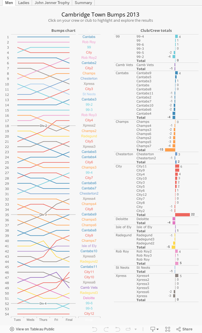
I started rowing just over a year ago and last summer competed in the Cambridge town bumps for the first time. Bumps racing is a form of rowing race where crews chase each other in single file, attempting to catch or 'bump' each other. In the Cambridge version racing takes place over 4 consecutive days. If one crew bumps another crew, they both drop out of that days race and swap starting positions for the next day. Postitions are maintained from one year to the next with clubs and crews working their way up or down the river over time.

This form of racing has given its name to a type of chart called a 'bumps chart', which shows changes in rank (or boat position in our case) over time.  This sort of chart has been blogged about and discussed in various places and there are countless examples all over the 
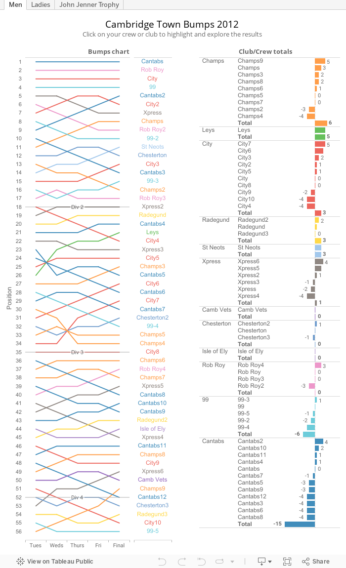
interwebs.  The 'official' chart for the Cambridge Town Bumps (town clubs as opposed to colleges) is a static image that looks like it's been generated using Excel.  This is the mens chart from last year taken from the CRA website:


It does the job, but it would be nice if there was an interactive version that allowed you to highlight individual crews or clubs, or maybe see the overall places gained and lost during the week.  There is an award each year for the best overall club called the John Jenner Trophy, but the results are stored in a nasty native html table near the bottom of the results page, which is difficult to read.  With this in mind, I thought I'd create my own version using Tableau Public.

The Mens and Ladies tabs contain the bumps charts for the respective divisions, but also show a summary table that shows how each club and crew has done during the week.  Selecting a club in the table will highlight all the crews from that club in the bumps chart.  This also works the other way around.

The John Jenner Trophy tab shows an overview of each clubs crews and performance as well as a chart showing the final positions.

I've given each club a colour that is close to the actual crew colours, which I think works ok.  The aim is allow users to be able to pick out a club more easily than if every line was the same colour.  I've tried to avoid a 'rainbow' effect by muting the colours slightly.

Anyway, it's a start.  Next step is to try and incorporate a few years worth of data to see what patterns emerge.